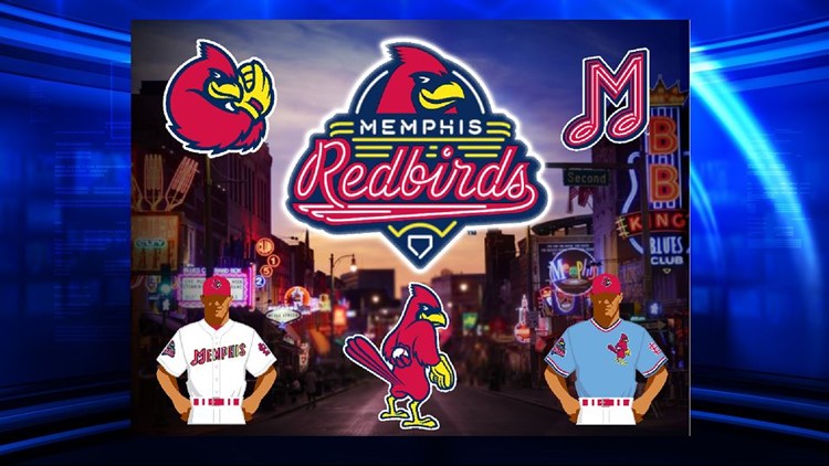
The Memphis Redbirds unveiled a rebrand Wednesday at AutoZone Park. The team has a new logo, uniforms, and hats for the 2017 season.
The Redbirds principal owner said the changes are proof the team wants to bring in more fans and sponsors.
Beyond the new uniform unveiling, the Redbirds principal owner told Local 24 this is the beginning of other upgrades for the team, on and off the diamond.
“We started with Beale Street. The iconic neon signs,” says Peter Freund, the Memphis Redbirds principal owner.
That neon yellow is the major focus of a retooled and revamped logo for the Redbirds. Team leaders also rolled out new hats, apparel, and jerseys to the community.
“We put Memphis on both the home and road jerseys and that was purposeful because this is Memphis’ team,” says Freund.
Freund said the new look intends to continue the team’s attendance momentum in 2017. Last year, the team reported a 17% attendance increase compared to the 2015 season.
“You don’t just refresh or rebrand for the sake of doing it. It has to be part of the story, so the story is to reconnect with the community,” says Freund.
New Memphis Redbirds’ manager Stubby Clapp believes the new uniform combinations can give his ballclub a little extra jolt when they take the field here in a few months.
“It’s like hitting the refresh button on the iPad,” says Clapp. “It’s awesome, obviously having new uniforms, having a new look. It gives everyone some energy.”
Freund they’ll be another announcement in the next week regarding upgrades at AutoZone Park. They’re expected to be done in time for the Redbirds exhibition in late March with their parent team the Saint Louis Cardinals.
(REDBIRDS NEWS RELEASE)
MEMPHIS, Tennessee – The Memphis Redbirds unveiled a new brand identity at AutoZone Park today that speaks directly to the soul of the city and its rich traditions.
The primary logo replicates that of a neon street sign, quickly calling to mind Memphis’ iconic Beale Street, located just a few blocks from the ballpark. The tube lighting is applied elsewhere throughout the brand package, including in the primary word mark and the numbers seen on the jerseys. Both the home and away uniforms feature the neon “Memphis” across the front with the neon “M” formed in the shape of a music note, to honor the home of the blues and the birthplace of rock ‘n’ roll.
“Upon purchasing the Redbirds, our first priority was to reconnect as a local business operating in downtown Memphis,” said Principal Owner Peter Freund. “In doing so, we felt we needed an authentic brand that represented not only the storied history of Memphis, but the heart of the city itself.”
“Throughout this process, we wanted to create a brand that we could activate,” said President/General Manager Craig Unger. “The new, more modern look pays homage to Memphis’ rich baseball heritage while keeping the connection to our St. Louis Cardinals affiliation. We have achieved this balance by maintaining the Redbirds name and color scheme, but also bringing back elements such as the music note ‘M’ from the 1970s.”
In order to successfully capture this essence of Memphis, the Redbirds turned to Dan Simon of Studio Simon for design.
“We were tremendously excited when the Redbirds came to Studio Simon and asked us to work together with them to create a brand identity that celebrated Memphis in a manner that evoked the unique flavor of such an incredible city, one that is a destination in and of itself,” said Dan Simon. “And to be able to marry that look with a nod to, and update of, one of the St. Louis Cardinals’ wonderful heritage logos was certainly delicious icing on the branding cake.”
The primary colors of the new brand are St. Louis Cardinals red, navy and yellow, to represent the affiliate of the Redbirds since 1998. There are two primary hat versions: a red home hat featuring a more modern take on Rockey the Redbird’s head, and the iconic music note neon “M” on a blue hat with a red bill. Fans will note a faint yellow outline around the jersey elements, which gives the effect that the neon is turned on.
Rockey has also been modernized as an edgy, bold and determined character, which embodies the spirit of Memphians. And the Redbirds are proud to bring back an iteration of Rockey as the Cardinals’ famous “Dirty Bird,” which will be featured on alternate powder blue jerseys the Cardinals made popular during the 1980s.
Fans immediately have a chance to secure new logoed merchandise in one of two mini-memberships. Fans will choose one of three different t-shirt designs, to go along with a ticket to the “Battle of the Birds” exhibition game against the Cardinals on March 30 plus a ticket to every Friday or every Saturday home game during the 2017 season. For more information on this brand new mini-membership, visit www.memphisredbirds.com.
Multiple season and additional mini-membership ticket options for the 2017 season are on sale now, and all include the “Battle of the Birds.” For more information on “Battle of the Birds,” visit www.memphisredbirds.com/battleofthebirds.


